Latest Blog Posts
- Joomla Hack: Converting the Article Category Module into a Clickable Dropdown Field
- Two Ways to Include jQuery in your Console
- Say No to Spec Work
- Beware the "Domain Notice Scam"
- Understanding Joomla Means Understanding Menus
- How to Set Joomla Page Titles
- 5 Ways to Link to PDF documents in Joomla
- How to Not be a Jerk on Internet Forums
- Ten Joomla Extensions that I'd Recommend
- Understanding Photo Resolution for Design: A Pizza Analogy
- Joomla Shortcut: Linking DJ Image Slider Slides to Documents and Other Files
- We're Keeping it Local
- We Speak Your Language
- The Advantages of Custom Joomla Templates
- 50 Free or Cheap Media Resources for Ministries and Churches
- Building Websites in a Small Town
- Joomla Hack: Converting the Article Categories Module into a Clickable Dropdown Field
- Website Must Haves
- Just say no to 99 Designs and Logo Tournament
- The "Above the Fold" Myth
- 4 Things Web Designers Wish Clients Knew
The Article Categories module provides a useful way to allow visitors to browse large chunks of content at a glance. This hack allows you to provide a slightly more elegant way of presenting your information. Rather than showing a simple list of categories, this hack turns this module into a dropdown field. Each category in the dropdown, once clicked, takes users immediately to their category of choice.
This hack requires making a small change to one of the core Joomla files... if you aren't comfortable doing this, I would avoid this solution.
Otherwise...
How to Display Joomla Categories in a Dropdown Field (Joomla 3.4.x):
You will need to edit this file: .../modules/mod_articles_categories/tmpl/default_items.php
My tweaked code looks like this:
How to Display Joomla Categories in a Dropdown Field (Joomla 2.5.x):
You will need to edit this file: .../modules/mod_articles_categories/tmpl/default_items.php
My tweaked code looks like this:
<select><option>Choose</option>
<?php
/** * @package Joomla.Site
* @subpackage   mod_articles_categories
* @copyright   Copyright (C) 2005 - 2013 Open Source Matters, Inc. All rights reserved.
* @license      GNU General Public License version 2 or later; see LICENSE.txt
*/// no direct accessdefined('_JEXEC') or die;foreach ($list as $item) :?>

<option onclick="window.location = '<?php echo JRoute::_(ContentHelperRoute::getCategoryRoute($item->id)); ?>'" <?php if ($_SERVER['PHP_SELF'] == JRoute::_(ContentHelperRoute::getCategoryRoute($item->id))) echo ' class="active"';?>> <?php $levelup=$item->level-$startLevel -1; ?>

<h<?php echo $params->get('item_heading')+ $levelup; ?>>
<?php echo $item->title;?>
</h<?php echo $params->get('item_heading')+ $levelup; ?>>

<?php
if($params->get('show_description', 0))
      {echo JHtml::_('content.prepare', $item->description, $item->getParams(),'mod_articles_categories.content');
}
if($params->get('show_children', 0) && (($params->get('maxlevel', 0) == 0) || ($params->get('maxlevel') >= ($item->level - $startLevel))) && count($item->getChildren()))      {
echo '<ul>';
$temp = $list;
$list = $item->getChildren();
require JModuleHelper::getLayoutPath('mod_articles_categories', $params->get('layout', 'default').'_items');
$list = $temp;
echo '</ul>';
}
?>
</option>
<?php endforeach; ?>
</select>
Basically, the list elements are replaced with field elements. There was also the need to change how the link is created to conform to a list style "on-click" route instead of the normal "<a href".
Along with making this tweak to the code, I changed the "Maximum Level Depth" to 1 in the Module Parameters. Make sure to do a proper template override on this module, or else you'll lose your changes on the next Joomla upgrade.
Hopefully this helps someone tackle this issue without investing tons of time reading up on it.
Add a comment
- Details
- Written by Ryan Simmons
 Regardless of complexity or price tag, every website should include all of the following items:
- What You Do/Who You Are: This may seem a little obvious, but in the fury of building a site and doing lots of "marketing" and "promoting" and "search engine optimizing", some websites skip this ever important detail. This important task doesn't have to be accomplished with a 1,000 word essay. You can use images or videos to communicate what it is you do and who you serve. Just make sure your purpose gets communicated somewhere on your website.
- Contact Information: This is so important! Having easy to access contact information like phone numbers, email addresses, mailing addresses and social network links can really make or break a visitor's time on your website. If this information isn't immediately available on your home page, or isn't available after just one click, an update is probably in order.
- Simple Navigation: Your website should be super easy to navigate. This means usually including one main menu that can help visitors find the information they need fast. The two pitfalls to watch out for here include having too many menus and having no menu at all (or having a menu that is difficult to find, which is basically the same thing as having no menu). Both are problems. A well designed site should have one central menu that serves as the backbone of the site. Beware of overly packed menus too... these often hinder more than they help. This is especially true for dropdown menus with more than 2 levels of depth. If your navigation menu has this many links... I'd recommend changing up the format of your main menu, or adding in some side menus.
- Graceful Failure: Websites don't always work. Sometimes links are incorrect. Sometimes your browser doesn't understand the underlying code of your site well enough to make it look correct (I'm looking at you Internet Explorer). Your website shouldn't grind to a complete hault just because one piece of the site fails. Bad links should lead to a helpful 404 page. Websites that aren't compatible with your browser should still be easily readable and reasonably clean even in older browsers.
- Mobile Layout/Responsive Design: In 2013, nearly 30% of all web traffic came from mobile devices. That means 1/3 of your website visitors are potentially using a smart phone or tablet. Your website should be easily accessible on their smaller screens. In the olden days of five years ago, completely separate mobile websites were the answer to this conundrum. Today, the best way to achieve this mobile-friendly strategy is via responsive design. With responsive design, clients only need to manage one site, but the site will automatically rearrange itself to fit into a smaller space. Even if your site isn't ready for responsive design quite yet, make sure that your menus are navigable with taps (instead of clicks) and your overall website file size remains as small as possible. Full Disclosure: THIS site still needs the responsive treatment. It's hopefully coming very soon!
- Social Connections: People use the internet in vastly different ways. While some prefer to check out your organization's website, others may go looking for a Facebook page first, or maybe an Instagram account, or possible a Twitter account. If you aren't represented in these areas, your business is probably losing out. Invest just a little bit of time in your social network connections. On a related note, most websites should have a way to easily share their information to social networks. Adding in widgets like the "Add This" bar is a simple, easy way to let visitors spread the word on your organization for you.
These are the basics, but I'm sure I missed some. What else should go in the "Must Have" website list?
Add a comment
- Details
- Written by Ryan Simmons
 Imagine you are a skilled laborer, and you are starving for work. One day you hear about a job opportunity at a construction company in the city. So you trudge downtown and get in a line with a bunch of other workers, hoping you make the cut.
To your delight, you get to go out on the job. In fact, every single person in the line goes out on the job, even those that don't look like they can swing a hammer, paint in a straight line or put up drywall. But a job's a job, and you shrug it off.
On arriving at the job site, the contractor in charge gives an odd speech.
"All of you have the chance of making $500 today!" he shouts with enthusiasm.
Many of the workers smile. Some give a shout, while others clap behind you in approval.
"But only one of you will actually get that $500!" continues the contractor. "All of you will work and put in a full day's effort. The best employee will receive this payment."
The shouts and clapping turned to groans as many of the workers look around to see if this whole thing is a joke.
"But don't dismay," the contractor interjects, obviously catching their concern. "If you all come back tomorrow, maybe YOU could win. Tomorrow, it might even be $1,000!"
The workers drop their gear and walk off the worksite to find an actual job that will pay them for their time and hardwork.
Does any of this story sound insane? No person would go work for an employer like this.
But this is exactly how websites like 99 Designs and Logo Tournament operate. These sites allow clients to post design projects. Designers can submit their designs to the project, and the client gets to choose the best design. The winner of each contest receives several hundred to a couple thousand dollars depending on the size of the project, and how much the client is willing to pay.
This is called speculative design. It turns what should be a respected career path into a gamble, and it turns great design into nothing more than a slapdash second rate product. The winner in this deal is the client, with 99 Designs and Logo Tournament coming in a close second. The designer loses 99% of the time.
If you are a graphic designer, logo designer or web designer, I would urge you to never, ever submit work on speculation. You are robbing yourself and harming the industry by contributing your hard-earned experience to the "Maybe I'll pay you" concept. If you are a client in need of graphic or web design, hire a high quality, local designer who genuinely cares about your organization, and will give you an excellent, well thought out design.
Add a comment
- Details
- Written by Ryan Simmons
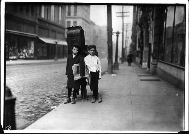 A long time ago, when the world was black and white, and people used phrases like "Gad Zooks!" and "Jimminy Cricket!", the general populace used to get their information from folded sheets of paper. They would usually pick them up for just a few pennies a day, catching up on the latest baseball scores, stock market numbers and international intrigues. These wondrous inventions were called newspapers.
The really important information would be printed in big bold text above the fold. It caught viewers attention, and sold more newspapers. It was good, profitable design.
Fast forward to today, and newspapers are on the decline.
But what isn't on the decline is the idea that all the important stuff needs to be above the fold. Lots of web designers will tell you that if you want to communicate any information to website visitors, it should be on the screen, no scrolling required. They would have you believe that the average website user is a neanderthal who can't turn the wheel on their mouse or hit the down arrow on their keyboard.
It's time to retire the "above the fold" concept, at least in reference to websites. If "Above the Fold" myth was true, websites like Facebook, Twitter, Youtube and just about every major news portal would have collapsed a long time ago.
We are now 25ish years into the life of the internet. Website visitors can scroll, and it doesn't require that much effort.
But I can hear the voices of web designers crying out, torches and pitchforks in hand, "How will anyone find information that's buried way down the page?"
The key here is to focus on great design and clear navigation. If your site is well designed, the important information will stand out. If your site has clear, easy navigation, website visitors will find what they are looking for. These should be the true priorities of a web designer. And judging by the current infinite-scrolling-hero-region trend that I've seen in web design over the last couple years, these priorities are slowly taking hold.
Long live the scroll wheel! Long live great design!
Add a comment
- Details
- Written by Ryan Simmons
1. Your website isn't going to do much good if you don't actually use it.
Congratulations! You've just paid for a well designed website! It has all the fun tools that you asked for, including a blog, photo galleries, streaming video and contact forms. Now what?
From this point forward, the website is your baby. It can market your business and spread the word on your organization, but only if you login every once in a while and give it a whirl. Spend time on it as often as you can updating information, posting new photos, and adding valuable content. If you are a church, make sure to update the calendar, post sermons and add photos from recent events. If you are a business, post articles that your customers would find valuable. Explain why you matter, and why they should spend money at your organization.
If you don't have time to work on your website, consider enlisting a volunteer for your non-profit organization, or hiring someone to update it. Most web design companies, including this one, would love to help manage your website, and can do it without costing an arm and a leg.
2. When it comes to design, please trust our experienced professional opinion.
This may sound like we don't want your input. We love your input! It's what helps us understand your industry and make sure we know exactly how to serve you best. We know that you understand your clients, customers and constituents better than we do.
It is this trust that we would love for you to reciprocate. Whether we are designing a poster or a website, many thousands of hours of work, education and experience are guiding our design decisions, from what fonts and colors to use, to the overall layout of the piece. We want to take care of you, and we want your marketing piece to be effective. Trust us, we are on your team!
3. When you hire an agency or freelancer to build your website, you need to contribute your expertise.
As designers, we live in the world of colors, shapes, software and computer code. By and large, we don't know what it takes to run your business, what your customers are looking for, or how your non-profit functions.
We can build the structure of the website, but to make it a true website, we need content. Content includes information about your organization, information about your products and services, information about your staff, contact information, photos and videos. We can even assist in creating this content, but we still need information to go on. If you are starting a brand new website project with an agency, be prepared to answer lots of questions. The sooner you provide this information, the sooner you've got an excellent website.
4. Search Engine Optimization (SEO) doesn't happen overnight.
As web developers, we wish that we could launch your website on a Tuesday, and by Wednesday morning, your website would show up at the top of Google search results for every single key word or phrase you'd like.
Alas, that is a super power that we don't have. In fact, no one has that ability. In our experience, getting your site on the first page of results takes anywhere from 2 to 6 weeks. Getting within the top five may take even longer.
There are many, many reasons your site may not be at the top of a search engine page. But to summarize (too) briefly, there are many thousands of other websites competing to get that top spot who have been out on the internet longer than your site, and you need to establish some credibility. I'll write up another post talking about how to establish this website credibility at a later time. The good news here is that, while time consuming, it's not technically difficult. Most clients can handle it on their own if they know what to do.
Add a comment
- Details
- Written by Ryan Simmons